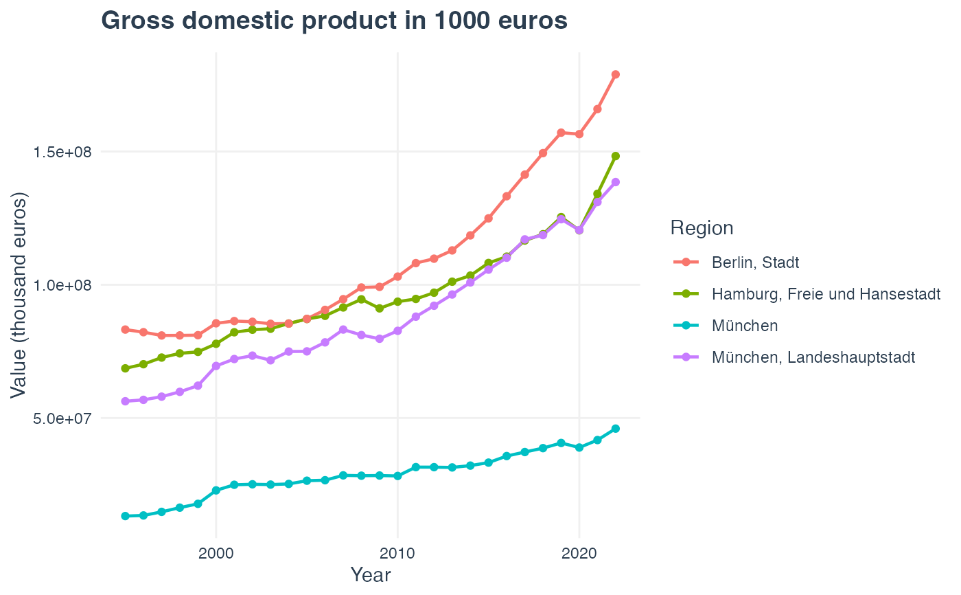
Creates a ggplot2 line chart showing how indicator values change over time
for selected regions. Input must be a long-format data frame from
get_inkar_data().
Usage
inkar_trends(data, regions = NULL, title = NULL, mode = c("light", "dark"))Arguments
- data
A long-format data frame from
get_inkar_data().- regions
Optional character vector. Region names (partial match) to include. If
NULL, all regions are plotted.- title
Optional character. Custom plot title. Defaults to indicator name.
- mode
Character.
"light"(default) or"dark"theme.
Examples
# \donttest{
df <- try(get_inkar_data("011", level = "KRE", lang = "en"))
#> Using M_ID '11' directly.
#> ✔ Downloaded: Gross domestic product in 1000 euros [thousand euros]
#> Level: Kreise | Regions: 400 | Year(s): 1995–2022 | Rows: 11200
if (is.data.frame(df)) {
inkar_trends(df, regions = c("Berlin", "Hamburg", "München"))
}
 # }
# }